
Design is important. Design says something about the institution. It gives you the flavor of what it represents.
So while many people may think of the driver's license as an ordinary, matter of fact document, it's design is really very important.
The driver's license connects the identity of the individual and ties it in to the identity of the state. My Ohio license is what makes me an "Ohioan" in no uncertain terms. If an Ohioan should display it outside of Ohio, the design of the document says something about Ohio.
But don't take my word for it, look at how Alberta chooses to design its license:
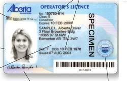
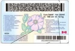
It's an awesome document, and these images don't give the colors justice. It says a lot about Alberta--its natural beauty, it's sophistication, it's progressiveness. Anyone from Alberta would be proud to have such a document. (The design details are fantastic. Fonts were chosen with care. The colors and design surrounding the photograph help make the photograph feel like an integral part of the document, as opposed to some terrible copy and paste job.)
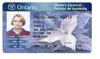
Here's the Ontario license, a bit less sophisticated, but a classic design. Ontario uses the Trillium flower as a major part of its branding. It's not an amazing design, but it's still very attractive and high quality. No one from Ontario would be embarrassed to have this license. (Note: pictured are the old Alberta and Ontario licenses, I can't seem to find images of the new ones.)
So it was with much excitement that I read that our own Ohio BMV would be introducing a new license. Now, after 13 or so years, we can finally rid of ourselves of this mediocre, ugly document. We could have something new that we could be proud of, that said something positive and energizing about our state.
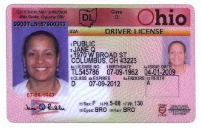
It's shit.
Absolute shit. Utter trash. I am horrified that someone was paid money to design it. It is despicable in its mediocrity. At least the old license had an excuse for being ugly--it was designed in the mid 1990s when people didn't know any better. Now it's 2009 and there are no excuses for this negligence. I struggle to understand how someone could look at themselves in the mirror after designing such drivel.
It's deplorable aesthetics say quite a lot about the leadership at the BMV and the Ohio Department of Public Safety.
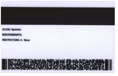
In fact, this document continues a design error from the last one of monumental proportions.
The last design of the Ohio license had a random audit number shown prominently above the main photograph. The audit number is essentially meaningless for anybody but a handful of BMV employees, but for reasons we simply do not understand, the number was the most obvious data field on the license based on where it was found.
This number caused huge issues during Ohio elections, which require, in some instances, that the voter write down their driver's license number. Naturally they chose the number which their eyes found and seemed to be the most obvious as the license number.
It's not like the BMV wasn't aware of this. It was the subject of quite a lot of articles.
And what did they do...? They made the exact same mistake, and made a meaningless auditing number the most promiment. I know the license is "their" document and not made for voting purposes (so making it easier to vote with is not their responsibility) but I feel like after being thoroughly embarrassed by their lame design, they would have made a new document with a much easier to find license number.
So they cluttered up the front of the license with crap like that auditing number which they could have easily put on the back, where there's enough space for a Russian novel. They cleverly place the only design detail of the document--a weak clip art image of the Ohio flag, right under the signature, ruining the clip art image and reducing the legibility of the signature (which appears quite small in the mock ups above. You know, you could do what Alberta did and move the description info (height, eye color, etc) to the back of the license. Would make for a lot more room for a bigger signature.)
It's just unspeakably bad.
4 comments:
and I thought that i ranted...
I don't believe in licensure.
This is the kind of indignation best saved for... well... anything else.
Thank you Anonymous. Your apathy and disregard for the people of Ohio indicate that a rewarding career at the Ohio Bureau of Motor Vehicles is in your future!
Post a Comment